In 2017, I shared how I took better iPhone photos—and that included my editing process in the app, A Color Story. (You can read that post here.) My process has changed a lot in the last year. I primarily take blog photos with my DLSR these days (iPhone photos just end up too blurry in blog posts, as you can see from my post yesterday) and then use my phone to take photos for Instagram.
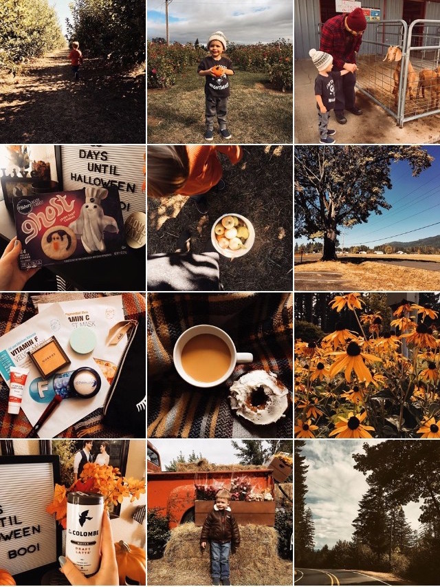
I recently started trying to keep a “theme” on Instagram. I had been planning to use a darker, orange-based filter for Autumn since at least late spring (yes, I am embarrassing) and when I finally got to start doing it, I was so excited. My feed looks lovely and I’ve had quite a few people message me asking about my process for editing.
So I thought I’d share a quick blog post about how I edit my photos. The process is pretty simple. Sometimes, it feels like people really complicate their photo editing process. I like to keep mine simple by saving my favorite filters in a sequence in A Color Story; this helps me always get roughly the same look (although sometimes I do adjust things later on).
Let’s start with a basic photo.
This is the process I use for a low-light photo. These are my standard filters; October is from the Seasons pack on A Color Story, Brent Wood is from the Mood pack, and Cashmere is from the Fawn pack. You can see that it increases contrast, adds a moody feel, and increases the warmth of anything that is golden- or warm-toned to begin with (like my skin and table). I will use this for darker photos as well and photos taken in better light. (I didn’t have any photos in need of editing for this example, so I know it’s not the greatest!) This set of filters is how I got the look on most of my photos on Instagram.
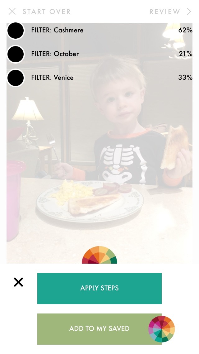
However, I do have a secondary set of filters that I use on Instagram specifically for photos where I don’t want my skin tone or Forrest’s skin tone to end up looking pumpkin colored.
In this photo, you see that Forrest’s skin tone was warmed up a little, but not much; the background is darker, the photo is moodier, and in general it looks like it would fit right in on my Instagram. (I love this photo of Fo because he looks like a little alien!) Cashmere, again, is from the Fawn pack; October is from the Seasons pack, and Venice is from the Mood pack. In general, this filter set is just a bit “lighter” on skin tones than my other, making it perfect for selfies.
So that’s it! That’s my process for editing photos for Autumn. Do you switch up your process seasonally?


