photo tips

3 Affordable Accessories to Improve Your Blog Photos

3 Affordable Accessories to Improve Your Blog Photos | Writing Between Pauses

One of the most difficult parts of blogging, for me, has always been the photography. I really enjoy photography, but it's not something I'm inherently good at--and I've never really been patient enough to really settle down and learn much beyond just getting it done. 

I don't think blog photos need to all look the same. Trust me on that one: you can be successful with photos taken on your iPhone. As I've written before, I have a tried-and-true process for iPhone photos. (You can also read my post on improving flat lay photos here.) 

Another thing I've always been unwilling to do is pour a ton of money into taking blog photos. If I already bought the product I'm taking a photo of, then why on earth would I spend more money to take a photo with it? I've never bought a better lens for my camera (despite really, really wanting one) because I just don't foresee it paying off in the long run; for the same reason, I just don't believe in buying a ton of materials to make my blog photos pop. 

Here's what I have bought to help improve my blog photos. 

1. Printed poster board ($1.99 at craft stores or $20+ for a pack) 

The biggest change to my photography game has been buying a printed poster board. I got mine for $2 from Michael's; it's a rustic, white, barn wood background. It has really made my photos look a lot prettier and more cohesive! Plus, it's easier for me to organize items on a smaller space. These are just like the one I have, but for a pack of 12! However, if you check your local craft stores, there are tons of designs, depending on what you want for your photos. There is a really pretty pink floral one at my local Michael's that I'm definitely considering. 

2. Create a "stage" (<$30) 

Many times, photos are staged on a platform. Many people use their desk that they clean up for this. However, I realized I needed a bit more space and freedom (and also my desk is a constant mess of bills and notebooks). I tore down a diaper box to be the bottom, plus 2 sides; I just recently bought some cheap sheets of tile, like you put on a backsplash, and have been working on a way to fix them onto the box. Then, I'll paste a plain white foam board to the bottom and voila! I've made my own little stage that can mimic a bathroom sink, or a kitchen counter, or anything really. This is still a work in process,  but so far, it's only cost me $20 for the three sheets of stick on tile and foam board. 

3. Camera Tripod (<$20) 

My greatest issue taking photos with my DLSR (which I've started to do more, even though I love the ease of just using my iPhone) is that I have quite shaky hands. If I'm taking photos in low light, then I've adjusted the settings on my camera enough that even the slightest shakiness will end up with blurry photos. I've just put in an order for a new tripod; I picked this one, which comes with a remote. However, you can find tripods for as cheap as $10-15, depending on where you look. As long as it attaches to your camera, or has a way of holding your cell phone, it doesn't need to be expensive! 

4 Tips for Taking Better iPhone Photos

4 Tips for Taking Better iPhone Photos | Writing Between Pauses

While I do own a DLSR camera, I find myself often too busy to actually use it. Lugging a large camera downstairs to take photos, all while trying to get everything done quickly, isn't super practical with a toddler. For that reason, I often use my iPhone to take photos and then I edit with A Color Story. I wanted to share my process and tips for taking my photos using my iPhone. For beginner bloggers (or really anyone!), it's totally possible to take all your photos with an iPhone--no expensive camera needed! 

1. Light Matters

Taking Better iPhone Photos

My usually process for taking photos is to get as close to a window as possible, but to avoid any direct sunlight. That means, my bedroom window in the morning or kitchen patio window in the afternoon: I get a good amount of light in these two spots, but because of the direction of the sun, it's not a super harsh direct light. Why should you avoid direct, bright sunlight? It will cast a harsh shadow over your photos that your iPhone camera can't correct and will ultimately make your photos look washed out. 

2. Pick a Consistent Background

Taking Better iPhone Photos for Blog

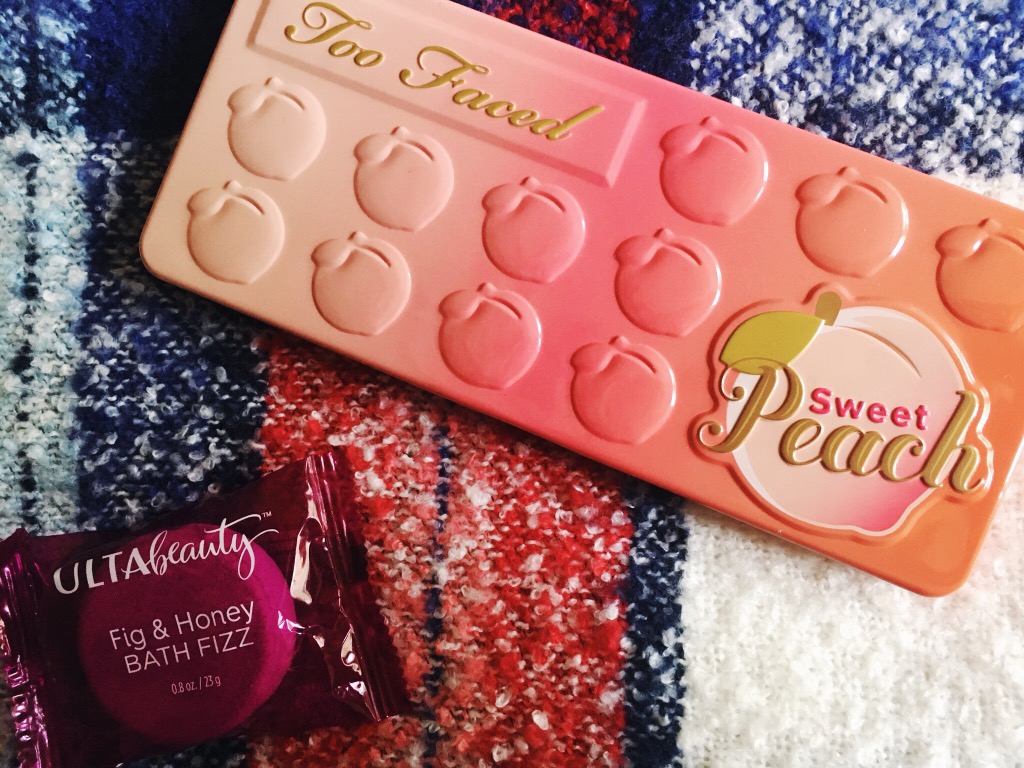
You may notice that I typically use a plaid background for my photos. Why? Mainly, I just like the look of it. While the typical white marble or white fence backgrounds are popular among bloggers, I didn't want to have to go buy a specific prop just for photos. I use my favorite blanket scarf! A lot of why I do this is to have a specific "style" of photo of my own--and also, I know how photos on my favorite background will look and I have worked out a way to do the best editing with this background. To me, this just makes it easier to take photos because I know how to edit them right off the bat. 

Some people like all white or solid color backgrounds for this reason, but for me, the plaid helps me angle things in a way that I like. 

3. Use an Editing App

Taking better photos with iPhone

As I mentioned, I use A Color Story to edit my photos. I find this the easiest app to use, mainly because I love the look of A Beautiful Mess's photos and their filter packs are affordable and really good for a variety of photos. Below, there is a step-by-step of how I edited the above photo. I took this photo in indirect sunlight outside. 

Step 1
Step 2

Step 1: I use the Disco Ball filter from the Good Vibes pack at less than 50%. Disco Ball increases the brightness, but doesn't increase shadows; it also makes everything a little "whiter". I like this filter to start out because it evens out the color really well. 

Step 2: I use the Palm Springs filter at less than 50% next. It's also from the Good Vibes pack. Just like Disco Ball, it brightens and whitens--but Palm Springs also gives a nice airy, light look to the photo while keeping it very clear. Contrast increases slightly. At this point, I'm just looking to make sure the white in my background is looking white instead of gray or cream. 

Step 3
Step 4

Step 3: I switch to the Seasons pack. Seasons is a pack you have to pay for, but at only $2.99, it's super affordable and I love these filters! FIrst, I use the December filter at around 50%. December increases contrast and shifts the color to be more blue or neutral (depending on how yellow everything is looking). I love how it punches up greens and blues in photos! This helps my photos look nice and vibrant. 

Step 4: I then apply October at less than 50% (I prefer closer to 30%). October is an extra step that I don't always use. It increases red and warm tones (notice how the red looks a little more vibrant and the orange in the leaf is more intense); for this photo, I just felt like it needed the warmth punched up a little more about I applied December. 

That's my exact photo process! It's easy to use and play with to get the look you want for your photos. 

4. Practice Makes Perfect

photo (20).jpg

There are still times when I don't get photos right. For example, in the photo above, I love the light and contrast--but the white of the scarf still looks gray and dingy; as well, the color of the flowers could be brighter in comparison to the red-black-and-pink tones of everything else in the photo. However, by practicing consistently and working to take better photos, I feel like I am always improving and getting better at my technique. 

3 Ways to Improve Your Flat Lay Photos

It took me a long time to get good at flat lay photos. I have some doozies on my Instagram from back in the day. I've just recently started to get good at it... probably because I only just recently started really, you know, trying. Mainly, I started spending a lot of time looking at flat lay photos that I like (you can view a collection of them on my Pinterest) and really figuring out how to do it. 

A few notes: 

  • I really believe in having your own "style." A lot of flat lays seem to follow a similar formula: white or marble background, gold or rose gold accents, truly random props. I'm not into that. I use two plaid scarves as my backgrounds because that feels a little more "my style" for Fall and Winter. Come Spring, I'll figure something out. 
  • Don't feel the need to take flat lay photos if you just don't like them! I like them: they're simple, they're pretty, and the more you practice, the easier they are to take. 
  • It doesn't have to be perfect. You don't need a DSLR. I use my iPhone. 

Ok, let's talk tips now. 

1. Have the right apps 

I use my iPhone to take all my flat lay photos. Here's why: It's easier. I can take one really quickly while Forrest is halfway destroying my kitchen, then get back to business. I take photos with my iPhone camera. I have the grid option turned on--you can turn this on in settings--because it helps center things and make sure you're getting a good angle. Then, I edit using A Color Story from A Beautiful Mess. You can use a variety of filters (and buy some extras), but I use the same filters every time: Magic Hour (25%), Ginger Tea (25%), Disco Ball (50%), then either Everyday (50%), Lite Bright (50%), or Ruby Haze (50% or less). If you feel your photo wasn't taken in the best light and has that slightly "yellow" look, you can adjust the white balance in A Color Story as well. 

2. Take photos near a window. 

Point blank: the best light is indirect sunlight. I take photos in my bedroom, with the curtains open, on my bed. So set up your photo station near a window and snap away. If I miss daylight hours (which I often do), it's a bust: I'll never be able to edit photos taken at night, under artificial lights, to look as good as I want them to. Sometimes, I still post them anyway, but only when desperate. 

3. Crop accordingly. 

I think the number one mistake that I continue to make is feeling like I should't "crop" a photo. But sometimes photos look better when you crop out extra space. Prime example: When I post flat lays of books (like this one or this one), I end up cropping out a lot of "extra space" so you can focus on the cover. Don't be afraid to crop and that means, maybe cropping something partly out of the photo (like I cropped out my Kindle partially in this photo). 


Most importantly, don't be afraid of being perfectly imperfect. Like if your nail polish is looking rough. Or it's something you don't want to, um, put down on the ground. Or if you son decides he wants the book you're trying to take a photo of. It's ok. It doesn't have to be perfect. It's just Instagram!